
LaNanz
A digital-first brand identity for a creative lifestyle label rooted in African heritage and contemporary aesthetics.

Project Context
LaNanz is a creative lifestyle brand that blends African heritage with contemporary minimalist aesthetics. The founder came to me with a powerful concept and a clear creative vision but no cohesive brand identity or web presence to match. The challenge: create a digital identity that could hold its own in a saturated lifestyle market while honouring its cultural roots.
Quick facts
Client
LaNanz
My role
Frontend Developer & Brand Designer
Timeline
4 weeks
Stack
React, Next.js, Branding, Tailwind CSS
The Challenge
LaNanz existed only as a concept and a social media presence with inconsistent visual language. Without a cohesive brand identity or website, they were losing credibility with potential stockists, collaborators, and premium customers who expected a brand to look and feel like it knew exactly who it was.
What We Set Out to Do
- 1
Develop a distinctive visual brand identity with a strong point of view
- 2
Create a web presence that tells the brand's story with clarity and confidence
- 3
Establish a consistent design language that can scale across product, packaging, and digital
- 4
Position LaNanz as a premium creative brand in the African lifestyle space
- 5
Build a responsive, visually striking site that earns attention and holds it
How We Got There
Brand Discovery
Understanding the Brand DNA
Extended conversations with the founder about the brand's references, cultural touchstones, and aspirational positioning. I built a brand brief that would guide every subsequent decision — from typeface to layout rhythm.
Mood Boarding
Visual Exploration
Three distinct aesthetic directions were explored: editorial minimalism, rich cultural maximalism, and a hybrid editorial-heritage approach. The founder immediately gravitated toward the hybrid — clean structure with cultural depth.
Brand Identity
Building the Visual System
Developed the full brand identity: wordmark and logo mark, colour palette drawing from African earth tones and contemporary neutrals, a paired typeface system (display + body), and a photography art direction guide.
Web Design
Translating Brand into Digital
Designed the website in Figma first — editorial-style layouts with strong typographic hierarchy, generous white space, and deliberate use of the brand palette. Each section was designed to advance the brand narrative.
Development
Building the Experience
Built with React and Next.js for performance and flexibility. Tailwind CSS for consistent styling. Subtle scroll and hover animations added using Framer Motion — purposeful, not decorative.
QA & Handover
Polish and Launch Prep
Cross-device testing, performance optimisation, and brand guidelines documentation. Handed over a living brand document alongside the codebase so the brand can grow consistently beyond this engagement.
Built With
What Was Built
Complete Brand Identity
Wordmark, logo mark, colour palette, typography system, and photography direction — a complete brand toolkit built for consistency and growth.
Editorial Layout System
Magazine-inspired layouts with strong typographic hierarchy that let the brand's story lead, without relying on product photography as a crutch.
Cultural Storytelling
Content architecture that honours African heritage while speaking fluently to a contemporary global audience — not one at the expense of the other.
Smooth Micro-Animations
Purposeful scroll and hover effects that elevate the premium feel of the brand without overwhelming the content or hurting performance.
Fully Responsive
The brand experience holds across all screen sizes — from mobile-first browsing to wide-screen editorial presentations.
Problems Worth Solving
Challenge
Balancing cultural authenticity with contemporary minimalist appeal for a global audience — too traditional risked feeling niche; too minimal risked losing the brand's entire point of difference.
Solution
I used layout and typography as the primary design language (clean, contemporary) while drawing on colour and motif references from African textile traditions as accent elements. The result felt cosmopolitan and rooted at the same time.
Challenge
Standing out in a deeply saturated fashion and lifestyle market where every brand has a slick website and an editorial Instagram.
Solution
I prioritised restraint over spectacle — fewer elements, more space, stronger typography. The brand's cultural story became the differentiator, and the design made room for that story rather than competing with it.
Challenge
The founder had strong creative opinions but limited technical vocabulary, making design feedback sessions complex and sometimes circular.
Solution
I shifted the feedback process from "does this look right?" to "does this feel like us?" — anchoring every decision to the brand brief we developed together in week one. This gave us shared language and made decisions faster and more confident.
Screens & Mockups
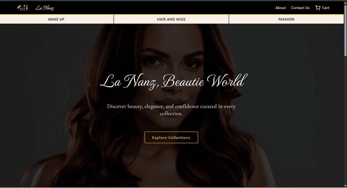
Homepage — brand story and visual identity above the fold
Editorial section — strong typographic hierarchy with brand palette
Mobile experience — brand identity preserved at every screen size
Results & Outcomes
Brand Identity Delivered
A complete, coherent brand system ready for consistent application across digital and physical touchpoints.
Delivery Timeline
Full brand identity and web presence delivered within a 4-week timeline from discovery to handover.
Market Positioning
LaNanz now presents as a premium lifestyle brand — credible to stockists, collaborators, and customers who judge by visual presentation.
Scalable System
A brand language and component library built to grow with the brand — not a one-off project, but a living system.
What I'd Do Differently
I'd invest more time upfront establishing a shared creative vocabulary with the founder. The brand brief we developed in week one was invaluable, but a more structured reference board, concrete yes/no/maybe examples, earlier in the process would have reduced revision cycles and given us both more confidence during real-time feedback sessions.
The scope of this project; brand identity and web presence in parallel — was ambitious for a four-week timeline. In hindsight, I'd stage the work more explicitly: lock the brand identity before touching the website design. The two workstreams influenced each other in ways that were creatively productive but occasionally inefficient. Sequencing them would have made both outputs stronger.
A Note on Process
Every project teaches me something about how to work better. These reflections aren't self-criticism, they're the lessons I carry into every engagement that follows.
Case Study Complete
Let's Build Something Together
Interested in working together? Whether you have a project in mind or just want to talk, my inbox is open.