
Kaka Memorial Foundation
Building a dignified digital home for a Nigerian nonprofit that honours legacy and inspires giving.

Project Context
Kaka Memorial Foundation is a Nigerian nonprofit dedicated to honouring a loved one while creating tangible change in local communities. They came to me with no web presence, no design assets, and a mission that deserved to be heard far beyond word-of-mouth. This became my first professional client engagement, and a project I'm genuinely proud of.
Quick facts
Client
Kaka Memorial Foundation
My role
Fullstack Developer
Timeline
6 weeks
Stack
Figma, Next.js, TypeScript, Tailwind CSS, Vercel
The Challenge
The foundation had no digital presence. Their outreach was confined to social media and direct contact, making it nearly impossible to reach international donors or build the institutional credibility that charitable giving requires. Potential supporters would search for them online and find nothing, a significant barrier to trust and growth.
What We Set Out to Do
- 1
Create a professional, accessible website that represents the foundation with dignity and clarity
- 2
Communicate the foundation's mission, values, and community impact compellingly
- 3
Build donor trust through transparency, storytelling, and a polished visual identity
- 4
Showcase the leadership team in a way that humanises the organisation
- 5
Provide a clear path for visitors to learn about donation and partnership opportunities
- 6
Achieve fast load times and full accessibility across all devices and screen sizes
How We Got There
Discovery
Understanding the Mission
I spent the first week in deep conversation with the foundation's leadership; learning about their history, community, the people they serve, and the story behind the name. No design work begins without understanding the why.
Information Architecture
Mapping the User Journey
I mapped out the ideal journey for three distinct visitors: first-time donors, community partners, and local community members. Each needed a different entry point but a unified story. The site structure flowed from this exercise.
Visual Identity
Creating the Brand Language
With no existing brand assets, I developed a complete visual identity; a colour palette drawn from Nigerian landscape and earth tones, a paired typeface system for authority and warmth, and a photography direction guide for the client's ongoing use.
Development
Building with Performance in Mind
Built with Next.js for static generation and optimal performance, TypeScript for reliability, and Tailwind CSS for consistent, responsive styling. Every component was built mobile-first with accessibility baked in from the start.
Testing
Cross-Device & Accessibility Review
Tested across eight device configurations, ran Lighthouse audits to hit 90+ scores across all categories, and conducted manual accessibility review including keyboard navigation and screen reader compatibility.
Launch
Deployment on Vercel
Deployed to Vercel with continuous deployment configured. Handed over documentation, a content update guide, and a brief training session so the client's team could manage the site independently going forward.
Built With
What Was Built
Mission-Centred Homepage
A scroll-driven narrative that leads with impact; communicating the foundation's why before its what, building emotional connection with first-time visitors.
Team Showcase
Individual profiles for leadership and key members, with bios that tell real stories. Humanising the organisation was central to building donor trust.
Donation Information Hub
Clear, trustworthy information about how to give, with transparency about how funds are used; structured to answer donor questions before they're asked.
Fully Responsive
Pixel-perfect on every screen size. The majority of the foundation's Nigerian audience accesses the web via mobile; this was non-negotiable.
SEO Optimised
Structured data, Open Graph meta tags, semantic HTML, and a sitemap configured so the foundation can be found by those looking for them.
High Performance
Next.js static generation, optimised images via next/image, and careful bundle management deliver fast load times even on slower connections.
Problems Worth Solving
Challenge
The client had no existing brand materials; no logo, no colour palette, no photography guidelines. I was starting from a blank canvas with a live deadline.
Solution
I treated brand development as a discovery process, not a design exercise. By grounding every decision in the foundation's values and the Nigerian context, I created a visual identity that felt authentic rather than generic, and the client immediately recognised it as "us".
Challenge
Communicating trustworthiness to international donors without established credentials, accreditation logos, or a track record of published financial reports.
Solution
I restructured the information hierarchy to lead with stories and team members before any ask. Emotional connection precedes institutional trust. I also added a dedicated transparency section that framed openness as a value, not a compliance checkbox.
Challenge
The client had a very limited image library, a handful of phone photos. Many sections of the site needed visual interest that the photography couldn't provide.
Solution
I leaned into a text-heavy editorial design language for key sections, using typographic hierarchy and spacing as the visual element. This actually felt more premium than relying on low-resolution photos, and gave the foundation a distinct aesthetic.
Screens & Mockups
Homepage - mission statement and primary call to action above the fold
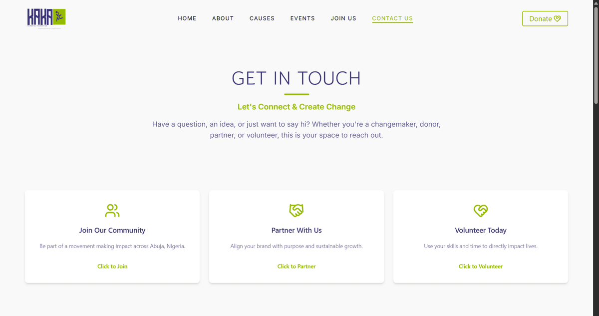
Contacts Sections - UX thinking
.png&w=1200&q=75)
Mobile First Donate Form - Form Design, UX thinking
Mobile
.png&w=828&q=75)
Mobile-first — optimised for the majority audience on smaller screens
.png&w=828&q=75)
Mobile-first — optimised for the majority audience on smaller screens
.png&w=828&q=75)
Mobile-first — optimised for the majority audience on smaller screens
Results & Outcomes
On-Time Delivery
Delivered within the agreed 6-week timeline with zero post-launch critical bugs.
Lighthouse Score
Performance, accessibility, best practices, and SEO all scored above 90 in Lighthouse audits.
Client Satisfaction
"She delivered beyond what we expected." Direct quote from the foundation's leadership team.
Digital Reach
The foundation now has a professional web presence that can reach international donors and partners for the first time.
What I'd Do Differently
With more time, I would have formalised the requirements process earlier; documenting a structured brief before moving into design, rather than letting discovery and design overlap. For a client without a prior digital presence, that ambiguity is natural; but a written scope document would have reduced revision cycles and given the client a clearer sense of what was being built and why.
I'd also build in a content strategy phase; helping the foundation develop the language for their mission, team pages, and donor calls to action before design begins. Content shapes structure, and structure shapes everything else. Getting that order right is something I now prioritise from day one.
A Note on Process
Every project teaches me something about how to work better. These reflections aren't self-criticism, they're the lessons I carry into every engagement that follows.
Case Study Complete
Let's Build Something Together
Interested in working together? Whether you have a project in mind or just want to talk, my inbox is open.